Project ID: 5
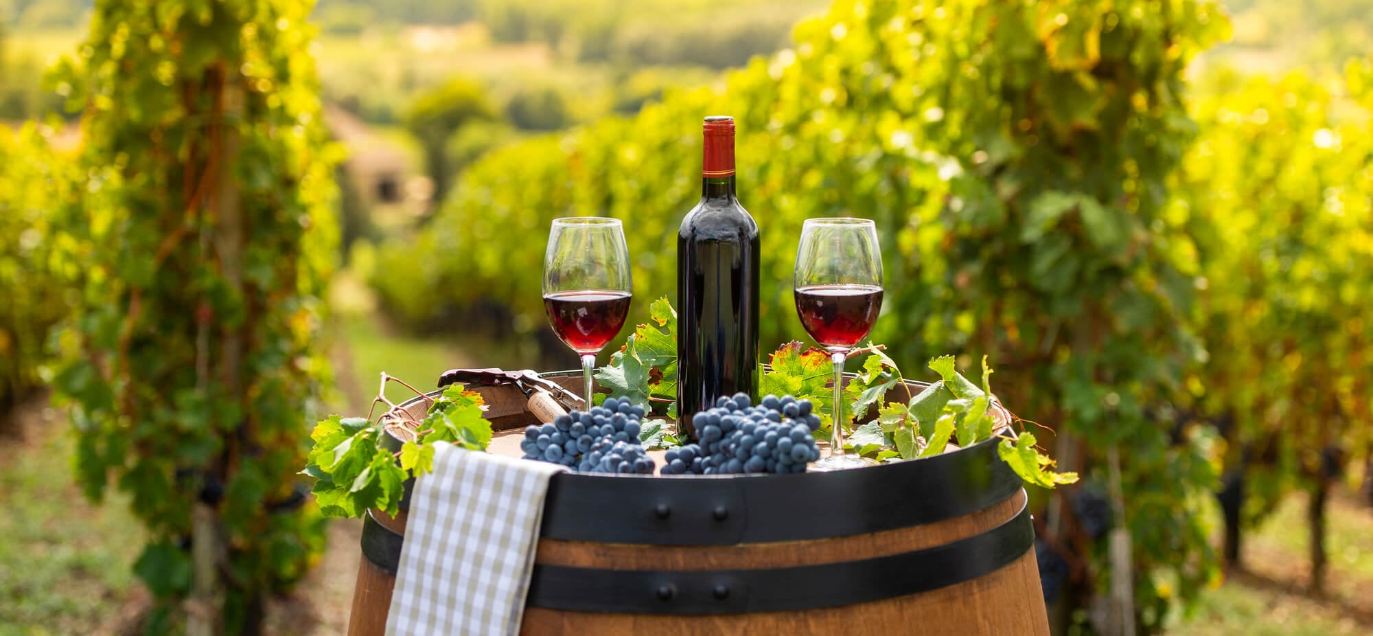
Wine Production, Consumption, and Reviews Around the World
To better understand wine trends worldwide, we focused on wine consumption and production over time. We were particularly interested in the price of specific wines based on location or province. To unpack our data, we created visualizations that depict trends and differences across time and region. Such factors we considered included wine consumption based on one's country of origin and wine production in varying countries and regions of the world. Lastly, we sought to compare the quality of wine with specific variables like fixed acidity.
Our exploratory questions consisted of the following. In Spain specifically, how does the region of cultivation and production impact the price of the wine? What countries/regions produce the most wine? What countries/regions consume the most wine? How has the wine market changed over time?
Our Data Sources
Most of our data is derived from the data science community platform Kaggle. Upon finding datasets, we were tasked with cleaning some 130,000+ rows to make them suitable for visualization creation and analysis. One segment of our research honed in on the provinces of Spain and how the prices of their wines vary. Aside from Kaggle, we found global wine production and consumption datasets on Statista.
Our Data Journey and Caveats
When we began our data journey, we encountered difficulty finding datasets that would allow us to create meaningful and diverse visualizations. Thanks to Kaggle and Statista, we overcame our struggles and found powerful yet lengthy datasets. After cleaning our data into a more accessible form, we created dataframes that laid the foundation for our visualizations. While experimenting with matplotlib.pyplot and plotly express, we created both static and interactive visualizations that tell an interesting story about the wines of the world. The process was not without trial and error, but it paid off in the end.

Who We Are!
Adele and Grace (22 and 21 respectively) both have a passion and appreciation for fine wines! Grace and Adele met in a Roman art history class sophomore year and became fast friends. The rest is history! While Grace enjoys cheap, sugary wines, Adele prefers cabernets and chardonnays.

Visualizations and Insights
Wine Consumption Across the World in 2023
This visualization shows wine consumption by country at a particular moment in time. Perhaps to little surprise, sommelier countries France, Italy, and Portugal are the darkest shades on the map with 20.56, 17.24, and 14.12 liters of wine consumed on a per capita basis in 2023. In majority-Muslim countries, such as Afghanistan and Saudi Arabia, wine consumption is at or around 0, perhaps a testament to the Islamic Faith's ban on alcohol. It is fascinating to see how cultural trends and philosophies impacted wine consumption in 2023, and this is a trend we will continue to witness over time.

In this graph, we focus particularly on Spain and the prices of its wine from various provinces. There is one notable outlier here, priced hundreds of euros higher than its counterparts in the dataset. That is El Perer, a single-vineyard Carignan grape wine from the Priorat region of Catalonia. While this graph does not express that level of specificity, it helps one make conclusions about the Spanish provinces and their abilities to create delicious, acclaimed, highly-priced wines.

This graph depicts wine production in countries and regions across the world in 2023. As is illustrated in the visualization, Europe came out on top in terms of wine production, with North America following not too far behind. Oceania, South America, Asia, and Africa had much lower rates of wine production, but they are impressive nonetheless.
This visualization suggests a dramatic fluctuation in the wine market between 2019 and 2023. The decrease in wine sales from 2019 to 2020 is likely a result of the COVID-19 pandemic. This low figure makes sense, considering restaurants shut down and could not serve wine to customers. Furthermore, social distancing reduced the number of gatherings, making individual alcohol purchases less frequent. The slow rise of the market in 2021 is a product of the economy restarting following the pandemic.
This visualization provides data on worldwide wine production in the form of a colorful choropleth map. Beginning in 1961 and ending in 2020, it measures each country's yearly wine production in tons. The countries shaded in dark purple are not high wine producers, whereas those shaded in lighter purple and pink are. By looking at this choropleth, an observer can conclude that Europe leads global wine production by a wide margin. For example, in 2017, France recorded 3.637 million tons of wine produced while Japan recorded a mere 78 thousand tons. Many more conclusions can be made, thanks to the user-friendly nature and conciseness of the graph.
Above is an interactive visualization that measures wine consumption on a country-to-country basis between 1961 and 2019. As is noted in the sidebar, the varying colors on the map measure wine consumption in liters. Mirroring the static wine consumption graph above, this visualization shows that France, Italy, and Portugal lead the world in wine consumption. This makes sense considering Europe also leads the world in wine production. Argentina also boasts very high levels of wine consumption.
In this project, we were able to put our newfound coding skills to the test and creatively express them. What started as a curiosity about wine production, consumption, reviews, and market prices developed into an opportunity for us to practice Python, HTML, and GitHub. Creating visualizations that were informative, insightful, and interactive was our favorite part of the project, and we hope others appreciate our findings!
Demo video
Please enjoy our walkthrough of the Worldly Wine Website! In this video, we explain our inspirations and goals for this project, our process of analyzing and cleaning data, the process of creating visualizations, and our main takeaways and analyses of the graphs included on our website. Thank you for your engagement with our website, and we hope that it has provided you with new information on the fantastic world of fine wines!